I Never Exceed 100 Chars When Designing UIs
January 2020
This essay is for builders, like me, who make things and need them to be used by as many people as possible. If you're a professional designer you already know this stuff.
--
A good user interface is a good combination of two things: it's pleasant to the eye and it's easy to understand.
It's not difficult to design a pleasant product, today. Good margins, a hierarchical font system, an accent colour, a few shades here and there. We're in the era of Design Systems: making beautiful UIs is now an engineering process.

However, the boundaries set by a Design System have little to do with making a product understandable.
This is not a big deal if the product fits a known archetype, like an e-commerce, a blog, or a social network. It doesn't really matter if you're a good or bad product designer: users will know the drill anyway. There's what I call a "product-pull".
Now, what if the product is complex? Or implements something truly new, like temporary shared content à-la Snapchat, or swipe right/left à-la Tinder?
One key mistake I used to make was to solve the whole issue by over-explaining the UI with text. It was a very convenient and very fast shortcut that also happened to be very counterproductive.
Text views are the deus ex-machina of user interfaces. Through them, you can literally speak with your users. You can explain them what is what, and how to use it. They come to the rescue in every situation.
The thing is that people don't read anymore.
They parse. They skim. But they're no longer provided with the attention span needed to read more than a couple of lines of text. The average user hits a button in order to figure out what was its purpose, not the other way around.
I feel that part of this effect is due to a low-to-none cost of being wrong. With the notable exception of payment buttons, in digital products there's no real cost attached to acting. The ultimate example of this pattern, of course, is Cmd+Z (Ctrl+Z).
Me ignoring this key human behaviour was a major flaw in my product design process. Needless to say, people weren't understanding the complex parts of the features I was designing.
So what I did was removing all the text fields and nothing else. This, of course, made thing worse.
See, the problem wasn't the text fields per se. Actually, the whole point is that text fields are irrelevant when it comes to making a product natural and easy to use. Because that's the UX job.
Removing the text "just because people don't read them" wasn't enough. I had to deeply review the whole user experience. Having the need to explain it with text was a big enough indication that there was something wrong to be addressed.
Think of Tinder.
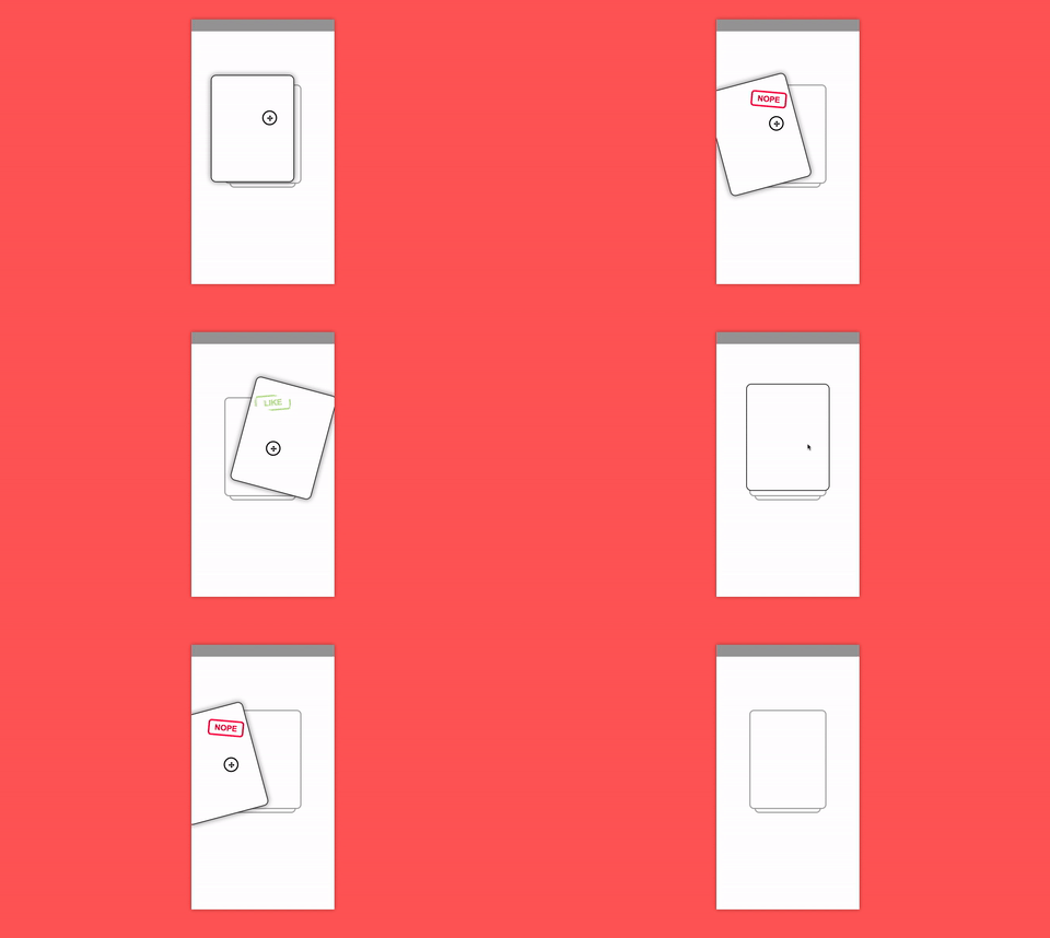
Sloppy product design: a huge tutorial with plenty of text explaining to you that if you swipe left you're saying "nope", while swiping right it's "yep". The average user will skip the huge text, go directly to the stacked cards and start swiping. They won't understand what's happening, and will inevitably stop using the app.
Great product design: an interactive tutorial. You get in the app and you are projected directly into action. The first swipes are "tests": you do them, and the app tells you what would've been the result. Animations and colours are key here. People will get very quickly what's the gist of the matter, and will keep using the product.

Generally, nowadays I always try to never go over 100 characters, in any text field. (it's a number I came up with empirically, and it's holding up pretty well so far)
This forces myself not to explain the product through text, and do it with a carefully designed UX. It's an easy but super effective litmus test: am I being sloppy with my product design?
Good products are beautiful and easy to understand. If you need to explain them with lengthy text labels, you're doing something wrong.
Never go over 100 chars. Take the longer route. It's worth it.
• • •